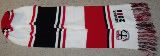
When the team ran out the first time, from the front of level 3 they looked excactly like the Fremantle Dockers -- dark with anarrow white vertical band /anchor / cross.
Then when we ran out later, in our white strip, we looked just like ... the Fremantle Dockers. All white with a dark vertical band /anchor / cross.
It's beyond me -- what are they thinking when they design these irrelevant jumpers?
Why cant we look like St Kilda when we play ????
Very disappointed, again.
Is the any reason why we'd want to look like the Dockers?
Moderators: Saintsational Administrators, Saintsational Moderators

-
Enrico_Misso
- Saintsational Legend
- Posts: 11662
- Joined: Tue 13 Jun 2006 12:11am
- Location: Moorabbin Chapter of The Royal Society of Hagiographers
- Has thanked: 315 times
- Been thanked: 720 times
Our colours are Red White and Black.
Not White with a dash of R&B.
In the drawn GF the best photo of BJs iconic mark taken side on at the peak of his leap shows BJ in a Docker jumper taking the mark of the season.
Not White with a dash of R&B.
In the drawn GF the best photo of BJs iconic mark taken side on at the peak of his leap shows BJ in a Docker jumper taking the mark of the season.
The rest of Australia can wander mask-free, socialise, eat out, no curfews, no zoning, no police rings of steel, no illogical inconsistent rules.
They can even WATCH LIVE FOOTY!
They can even WATCH LIVE FOOTY!
-
avid
- Club Player
- Posts: 1625
- Joined: Tue 11 Mar 2008 1:54am
- Location: St Kilda
- Has thanked: 19 times
- Been thanked: 86 times
Yes -- and from another angle it looks like a collingwood jumper! -- just a black stripe on some white either side. It's bad when such an iconic, historic moment like that doesn't look like it's your team.Enrico_Misso wrote:Our colours are Red White and Black.
Not White with a dash of R&B.
In the drawn GF the best photo of BJs iconic mark taken side on at the peak of his leap shows BJ in a Docker jumper taking the mark of the season.
Yep you said that last season and if they had their normal jumper on it would have looked like Essendon.Enrico_Misso wrote:Our colours are Red White and Black.
Not White with a dash of R&B.
In the drawn GF the best photo of BJs iconic mark taken side on at the peak of his leap shows BJ in a Docker jumper taking the mark of the season.


-
wasaintsfan
- Club Player
- Posts: 1315
- Joined: Tue 15 Sep 2009 10:28pm
- Been thanked: 11 times
-
Dr Spaceman

- Saintsational Legend
- Posts: 14102
- Joined: Thu 24 Sep 2009 11:07pm
- Location: Newtown Institute of Saintology
- Has thanked: 104 times
- Been thanked: 62 times
Can understand some people getting worked up about the jumpers we wear during the season and, hopefully, the Finals.wasaintsfan wrote:loved the shirts not for a permanent thing but they were awesomesome thinking out the square
if we always do the same thing week in week out..... our history will not change... even something as little as jumpers
But NAB Cup I couldn't care less.
For what it's worth I liked both versions.
-
bozza1980

- Club Player
- Posts: 1688
- Joined: Thu 27 Jan 2005 3:42pm
- Location: Melbourne
- Has thanked: 6 times
- Been thanked: 6 times
Re: Is the any reason why we'd want to look like the Dockers
Exactly is probably a poor choice of words, as I don't know how a red black and white with a cross jumper looks EXACTLY like a purple jumper with an anchor.avid wrote:When the team ran out the first time, from the front of level 3 they looked excactly like the Fremantle Dockers -- dark with anarrow white vertical band /anchor / cross.
Then when we ran out later, in our white strip, we looked just like ... the Fremantle Dockers. All white with a dark vertical band /anchor / cross.
It's beyond me -- what are they thinking when they design these irrelevant jumpers?
Why cant we look like St Kilda when we play ????
Very disappointed, again.
I liked it and it was a further differentiation of the nab cup from the real stuff.
Life is very short and there's no time for fussing and fighting my friends.
-
bozza1980
- Club Player
- Posts: 1688
- Joined: Thu 27 Jan 2005 3:42pm
- Location: Melbourne
- Has thanked: 6 times
- Been thanked: 6 times
Re: Is the any reason why we'd want to look like the Dockers
Exactly is probably a poor choice of words, as I don't know how a red black and white with a cross jumper looks EXACTLY like a purple jumper with an anchor.avid wrote:When the team ran out the first time, from the front of level 3 they looked excactly like the Fremantle Dockers -- dark with anarrow white vertical band /anchor / cross.
Then when we ran out later, in our white strip, we looked just like ... the Fremantle Dockers. All white with a dark vertical band /anchor / cross.
It's beyond me -- what are they thinking when they design these irrelevant jumpers?
Why cant we look like St Kilda when we play ????
Very disappointed, again.
I liked it and it was a further differentiation of the nab cup from the real stuff.
Life is very short and there's no time for fussing and fighting my friends.
-
Dal_Santos_Gal

- Saintsational Legend
- Posts: 5158
- Joined: Fri 18 Mar 2005 9:38pm
- Location: In the Saints Year Unknown Premiership Cup
- Contact:
glad I was not the only one thinking that... As soon as my husband saw the jumpers last night he said, you look like Freo but in Red, White and Black.
Tend to agree with him, I just wish we could wear the traditional jumper. Its the best looking jumper in the league....
Tend to agree with him, I just wish we could wear the traditional jumper. Its the best looking jumper in the league....
In Ross Get lost!
I am excited to stay at St Kilda and this is a great result for the Club and all our fans. I’m proud to be part of the Saints and am pleased to be playing football with the Clubâ€
I am excited to stay at St Kilda and this is a great result for the Club and all our fans. I’m proud to be part of the Saints and am pleased to be playing football with the Clubâ€
-
Sainternist
- Saintsational Legend
- Posts: 11340
- Joined: Thu 11 Mar 2004 12:57am
- Location: South of Heaven
- Has thanked: 1332 times
- Been thanked: 456 times


-
Hurricane

- Saintsational Legend
- Posts: 4038
- Joined: Wed 10 Mar 2004 9:24pm
- Location: The isle of Besaid, Spira
I liked the jumper myself.
Its only a preseason strip anyway and IMHO the reason for the white one was to avoid a colour clash against Essendon who STILL get away with refusing to come up with anotehr strip.
As for looking like Fremantle I didnt see any resemblance between our strips last night and anything Freo has ever worn in their history.
BANG BANG
Mitsuharu Misawa 1962 - 2009.
I am vengeance....I am the night...I....AM.....BATMAN
I have come here to chew bubblegum and kick ass and im all out of bubblegum
I am vengeance....I am the night...I....AM.....BATMAN
I have come here to chew bubblegum and kick ass and im all out of bubblegum
-
Armoooo

- Saintsational Legend
- Posts: 7281
- Joined: Sun 26 Nov 2006 2:28pm
- Location: The Great South East
- Contact:
The jumpers that they were wearing are the ones that i designed a couple of years ago however they made some variations which IMO absolutely ruined them.
1. They put the club crest in the centre, I can't stand this personally, I believe the Crest should stay where it normally is, looks far classier.
2. They drastically reduced the red outline around the cross, in my original design the red outline is very, very noticable. Last night it just looked like a black or white cross.
3. The centre of the cross doesn't go around the back, it is just on the front panel, IMO it looks terrible.
They made subtle changes to my original design when they used them as a training top a couple of years ago but IMO the training top still looked absolutely fantastic.
As for saying we look like Fremantle I think that's a bit silly. Would you say that our club logo looks like a fremantle jumper? of course not.
The jumper was designed to greater represent the clubs logo as a suitable alternative.
ROBERT HARVEY A.K.A The Great Man, Banger, Harves, Ol' Man River...
384 games, 4 B&F's, 3 EJ Whitten Medals, St.Kilda Captain, 2 Time Brownlow Medalist, 8 Time All Australian, 2nd Highest Brownlow votes poller.... The greatest of ALL TIME!!
384 games, 4 B&F's, 3 EJ Whitten Medals, St.Kilda Captain, 2 Time Brownlow Medalist, 8 Time All Australian, 2nd Highest Brownlow votes poller.... The greatest of ALL TIME!!

I liked the design, just though it needed a little more red. Maybe a red outline around the cross? I don't know, but it ain't a St. Kilda jumper without the red being clearly visible.
So this is only for the preseason? If that's the case, it's no big deal. But still, you'd think the designers would've saw the flaws in the first place.
So this is only for the preseason? If that's the case, it's no big deal. But still, you'd think the designers would've saw the flaws in the first place.
-
Armoooo
- Saintsational Legend
- Posts: 7281
- Joined: Sun 26 Nov 2006 2:28pm
- Location: The Great South East
- Contact:
On both jumpers there is a red outline around the cross, however it is so thin it isn't noticeable from any sort of distance.sRaf wrote:I liked the design, just though it needed a little more red. Maybe a red outline around the cross? I don't know, but it ain't a St. Kilda jumper without the red being clearly visible.
So this is only for the preseason? If that's the case, it's no big deal. But still, you'd think the designers would've saw the flaws in the first place.
It is supposed to be just for the Nab cup but I wouldn't be surprised to see it pop up in a few training session photos throughout the year.
ROBERT HARVEY A.K.A The Great Man, Banger, Harves, Ol' Man River...
384 games, 4 B&F's, 3 EJ Whitten Medals, St.Kilda Captain, 2 Time Brownlow Medalist, 8 Time All Australian, 2nd Highest Brownlow votes poller.... The greatest of ALL TIME!!
384 games, 4 B&F's, 3 EJ Whitten Medals, St.Kilda Captain, 2 Time Brownlow Medalist, 8 Time All Australian, 2nd Highest Brownlow votes poller.... The greatest of ALL TIME!!
-
MCG-Unit
- SS Life Member
- Posts: 3149
- Joined: Thu 11 Mar 2004 4:04pm
- Location: Land of the Giants
- Has thanked: 542 times
- Been thanked: 20 times
I quite liked the white one from last night (except for the crest in the center) Still trying to get that 2008 training jumper, white with the cross, can't find one - did you design that ?Armoooo wrote:The jumpers that they were wearing are the ones that i designed a couple of years ago however they made some variations which IMO absolutely ruined them.
1. They put the club crest in the centre, I can't stand this personally, I believe the Crest should stay where it normally is, looks far classier.
2. They drastically reduced the red outline around the cross, in my original design the red outline is very, very noticable. Last night it just looked like a black or white cross.
3. The centre of the cross doesn't go around the back, it is just on the front panel, IMO it looks terrible.
They made subtle changes to my original design when they used them as a training top a couple of years ago but IMO the training top still looked absolutely fantastic.....
No Contract, No contact 
-
Armoooo
- Saintsational Legend
- Posts: 7281
- Joined: Sun 26 Nov 2006 2:28pm
- Location: The Great South East
- Contact:
Yeah I designed it in school one day, later on I posted it on I posted in on Saintsational and it got a pretty good response.MCG-Unit wrote:I quite liked the white one from last night (except for the crest in the center) Still trying to get that 2008 training jumper, white with the cross, can't find one - did you design that ?Armoooo wrote:The jumpers that they were wearing are the ones that i designed a couple of years ago however they made some variations which IMO absolutely ruined them.
1. They put the club crest in the centre, I can't stand this personally, I believe the Crest should stay where it normally is, looks far classier.
2. They drastically reduced the red outline around the cross, in my original design the red outline is very, very noticable. Last night it just looked like a black or white cross.
3. The centre of the cross doesn't go around the back, it is just on the front panel, IMO it looks terrible.
They made subtle changes to my original design when they used them as a training top a couple of years ago but IMO the training top still looked absolutely fantastic.....
I Emailed the club about it and didn't hear anything back.
Then a year and a half later it was brought out as our training top, at the time I was dead broke and couldn't afford it so I emailed Archie Fraser, basically asking for a free one. He claimed that ISC designed it and said the best he could do was if I buy one he could get my favourite player to sign it.
I was a little disappointed with Archie's response because he was being quite a smart arse about it, especially considering I provided a link in which I introduced the jumper 18 months before ISC made theirs.
To this day I'm not sure if it was the club who saw it on here and sent the design to ISC, if ISC came across it by themselves or if just by co-incidence they came up with the exact same design.
It's my mission that St Kilda will one day wear a jumper I've designed on an actual game day, a NAB cup match would be nice, but a home and away match would be even better.
ROBERT HARVEY A.K.A The Great Man, Banger, Harves, Ol' Man River...
384 games, 4 B&F's, 3 EJ Whitten Medals, St.Kilda Captain, 2 Time Brownlow Medalist, 8 Time All Australian, 2nd Highest Brownlow votes poller.... The greatest of ALL TIME!!
384 games, 4 B&F's, 3 EJ Whitten Medals, St.Kilda Captain, 2 Time Brownlow Medalist, 8 Time All Australian, 2nd Highest Brownlow votes poller.... The greatest of ALL TIME!!