Membership Image

This unofficial St Kilda Saints fan forum is for people of all ages to chat Saints Footy and all posts must be respectful.

Moderators: Saintsational Administrators, Saintsational Moderators

Post Reply
User avatar
ChicagoSaint
Club Player
Posts: 1405
Joined: Tue 13 Jul 2010 3:15pm
Location: Seaford

Membership Image

Post: # 1016473Post ChicagoSaint »

Image

WTF??

The '1' and '1' are supposed to be a saints flag yeah?


User avatar
ChicagoSaint
Club Player
Posts: 1405
Joined: Tue 13 Jul 2010 3:15pm
Location: Seaford

Post: # 1016475Post ChicagoSaint »

Did AFL House design this as some sort of a sick prank?


sainta
Club Player
Posts: 500
Joined: Wed 10 Mar 2004 11:23pm
Location: Seaford
Contact:

Post: # 1016499Post sainta »

I like it. It's very clever. It just needs a bit of white in there or a white background to really accentuate our colours.


saintwalsh
Club Player
Posts: 69
Joined: Tue 21 Sep 2010 2:33am
Location: Templestowe

Post: # 1016509Post saintwalsh »

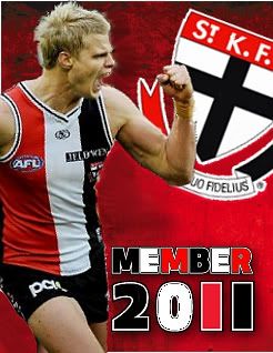
I think its a terrible design. The use of the different colours on the one's is soo ammature they havent even used the right amount of white to highlight the white on the numbers. I personally would have liked the image of BJ taking speccie as the imagine.


snowdelisaint
Club Player
Posts: 332
Joined: Wed 07 Oct 2009 8:51am

Post: # 1016527Post snowdelisaint »

Yep. Shocker. Unfortunately if you look at the sum of the marketing materials over the last ten years they accentuate the "rag-tag" idea that this club could do without.


User avatar
SirDog
Club Player
Posts: 261
Joined: Mon 16 Oct 2006 12:40am
Location: Perth, Western Australia
Contact:

Post: # 1016532Post SirDog »

I agree with the other comments, it definitely needs more white. It also kinda looks religious with the saints logo faded into the back ground and the cross accentuated. And would have liked a photo of Riewoldt when he is really pumped and raises his fist. Also no slogan?


St.Kilda fan - through and through.
shmic_s
Club Player
Posts: 963
Joined: Tue 03 Feb 2009 4:25pm
Has thanked: 23 times
Been thanked: 9 times

Post: # 1016534Post shmic_s »

I dont mind it. Maybe make the logo a bit more visible with a touch more white coming through. But otherwise fine. As for the slogan: Sainty footy is actions not words. :wink:


Sainternist
Saintsational Legend
Posts: 11293
Joined: Thu 11 Mar 2004 12:57am
Location: South of Heaven
Has thanked: 1287 times
Been thanked: 435 times

Post: # 1016541Post Sainternist »

saintwalsh wrote:I personally would have liked the image of BJ taking speccie as the imagine.
:!:


Curb your enthusiasm - you’re a St.Kilda supporter!!
Image
User avatar
SirDog
Club Player
Posts: 261
Joined: Mon 16 Oct 2006 12:40am
Location: Perth, Western Australia
Contact:

Post: # 1016548Post SirDog »

Original Logo: Image My preferred rejigged version: Image

It's a bit rough I know but it's too good a day to stay inside. But this is what I would have liked to see or something similar. I hope they did not pay the person who did the original too much $$$ because this took me about 15 mins. :P

I would have slotted a slogan in there if I was not in a rush.


St.Kilda fan - through and through.
User avatar
Shades
Club Player
Posts: 715
Joined: Sun 29 Jul 2007 11:13am
Location: Center half bench
Has thanked: 5 times
Been thanked: 2 times

Post: # 1016668Post Shades »

SirDog wrote:Original Logo: Image My preferred rejigged version: Image

It's a bit rough I know but it's too good a day to stay inside. But this is what I would have liked to see or something similar. I hope they did not pay the person who did the original too much $$$ because this took me about 15 mins. :P

I would have slotted a slogan in there if I was not in a rush.
I like it send it to the club?


User avatar
matrix
Saintsational Legend
Posts: 21475
Joined: Mon 21 May 2007 1:55pm
Has thanked: 4 times
Been thanked: 4 times

Post: # 1016686Post matrix »

god almighty they PAY people to come up with that?????????


SirDog
send it in :)
it about 3 times better


User avatar
St Fidelius
Saintsational Legend
Posts: 10492
Joined: Sun 01 Aug 2004 10:30am

Post: # 1016694Post St Fidelius »

SirDog wrote:Original Logo: Image My preferred rejigged version: Image

It's a bit rough I know but it's too good a day to stay inside. But this is what I would have liked to see or something similar. I hope they did not pay the person who did the original too much $$$ because this took me about 15 mins. :P

I would have slotted a slogan in there if I was not in a rush.
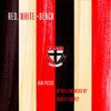
An improvement for sure.

The colours are far better and I like that Roo is wearing our home strip, instead of the Club's option of wearing the white shorts.

The only small problem is that home strip is the 2009 style


Don't wait for the light at the end of the tunnel to appear, run down there and light the bloody thing yourself!
Post Reply