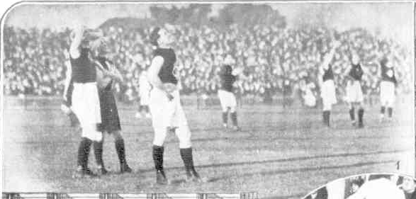
A black version of our current clash would be a great home strip. It's not just the actual design of the strip, but the fact that it's based on a jumper we wore over 100 years ago (1893-1914, post-original candy stripe and pre-red/yellow/black WW1 version) that makes it even better. Also shows up how poorly thought-out and ridiculous a lot of modern designs are.
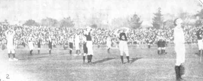
The closest I guess we have to a modern version of the jumper in the shot as a permanent design is when we wore black shorts with the candy stripe in a practice match against Sydney in 2006:

Interestingly, for a period when we originally wore this jumper, some players wore a similar-but-different version in the 1906-1909 seasons which probably had a lot more red and white, and concurrently with the "default" strip.
This is a 1906 photo which is on Boyles Football Photos (
http://www.boylesfootballphotos.net.au/HomePage):

Mero who operates
http://footyjumpers.com/ thinks it translates into something like this:

Which, given the bigger presence of red and where it's placed throughout the jumper would actually provide for a higher-contrasting clash jumper than we've had for the past decade or so.